AVRA
GOLDMAN
about
résumé
portfolio
linkedin
d3 blocks
AVRA
GOLDMAN
Data Visualization Designer
LANDING PAGE
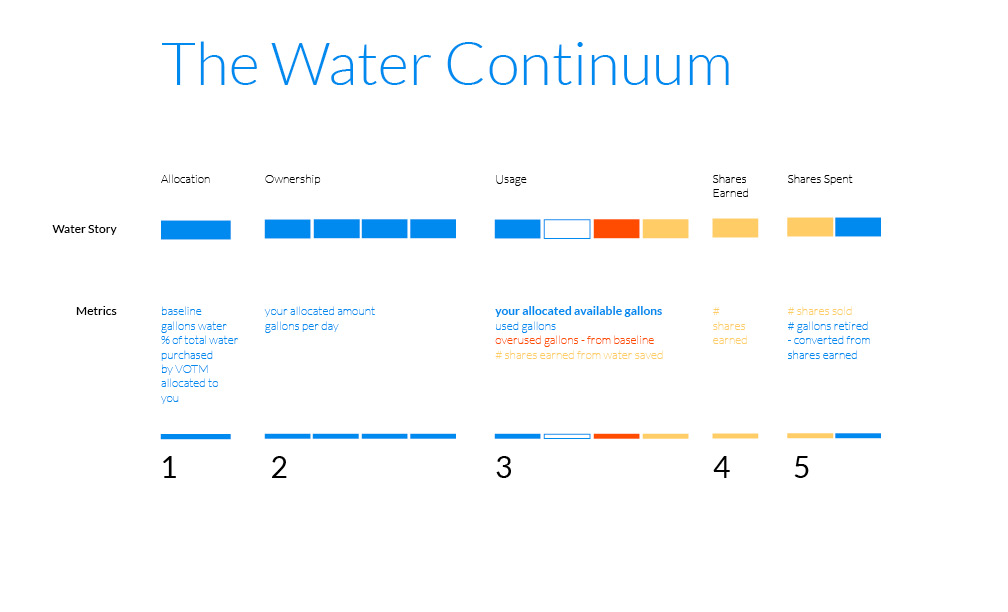
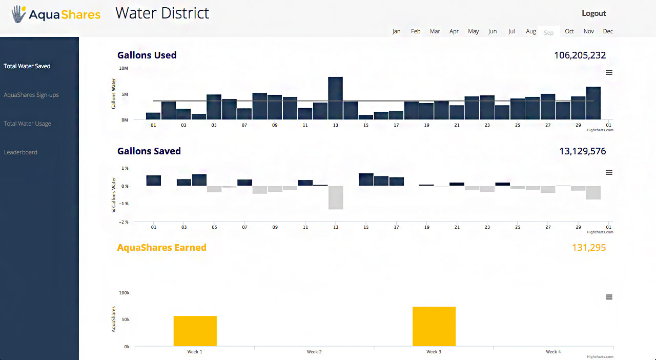
WATER SAVINGS
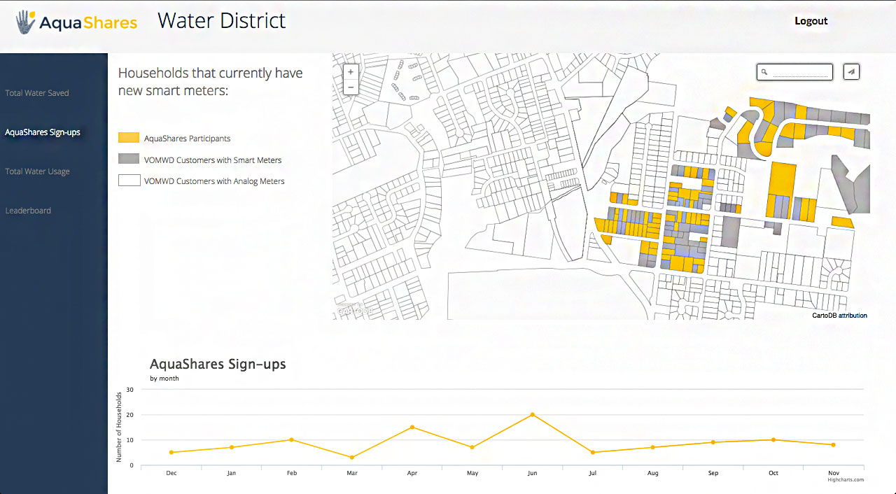
PROGRAM SIGN-UPS
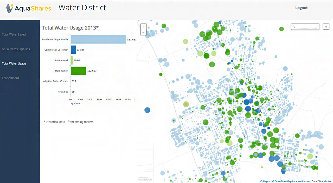
WATER USAGE